Your Custom Text Here
The unbuilt realm includes projects that weren’t realized due to budgetary constraints and projects that were designed to experiment with form, material or layout as a means of exploring the boundary between what “is” and what “could be” further, questioning whether what is, should be…
As one of the Crown Jewels of Minneapolis, the chain of city lakes that include, Cedar, Lake of the Isles, Bde MaKa Ska and Lake Harriet represent the ultimate canvas for an architect. If you can do a project there, new construction or otherwise, you have an opportunity to truly put your mark on the City.
So, when a lot presented itself on Cedar Lake, I felt it was ripe for dreaming big. The “Urban Retreat” was the result of this imagining. Given the inherent challenges in the site, its severe topography, the site was rife with both difficulty and opportunity. The steep slope rising from the parkway below to the elevation of the house creates practical challenges while simultaneously opening the site to wide vistas of the lake and the City skyline beyond, unimpeded by the flow of traffic below.
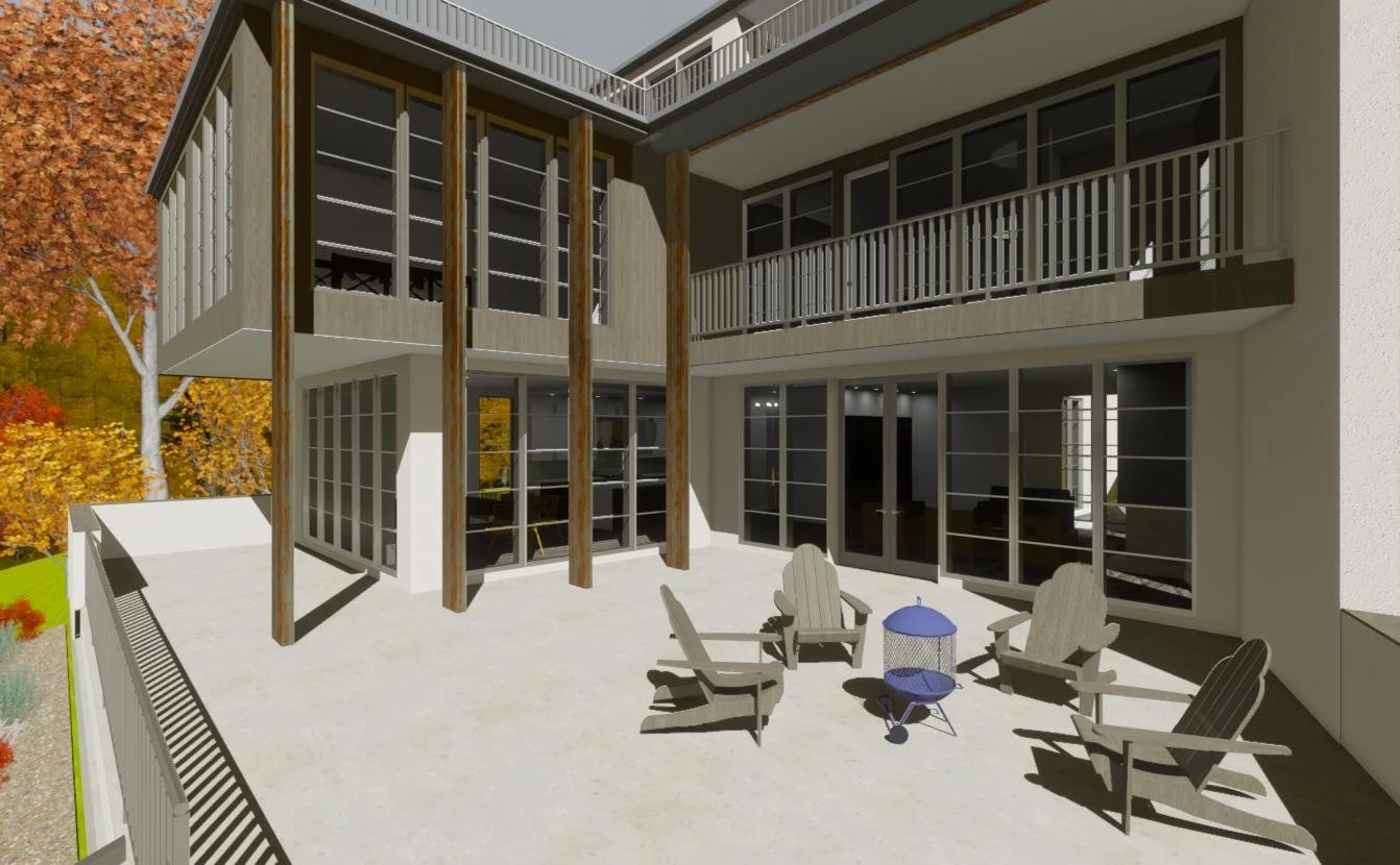
Equipped with an elevator, the house takes advantage of the verticality of the topography opening up exterior space that is partially protected from the elements by the house itself. The main living space created as an open concept, flowing from kitchen to living spaces and dining room. The inherent quality of the space at the back of the house to be more enclosed (built into the hill) meant that space was more suited to office and guest room spaces.
Moving up through the house, the second living level of the house is devoted to bedrooms and more private family space; more casual spaces for work and play.
The rooftop level is the ultimate entertainment space with an area devoted to outdoor living; open to the elements, covered and enclosed. With an elevator ride to the top, a kitchenette and powder room, it is the best place in the house to take in the views and panoramas afforded by its position high above the street.
Every room (and outdoor space) has a view…
Indoors and outdoors blend seamlessly.
More potential outdoor space on second floor
The kitchen is the hub of the three major spaces; kitchen, dining and living rooms.
Open to the Kitchen but separate from the Living Room
Easy connection to the Kitchen; circulation and cues in the ceiling offer spatial separation while retaining connection.
Potential views, even from the back of the room.
A great space for a pool table and movie night.
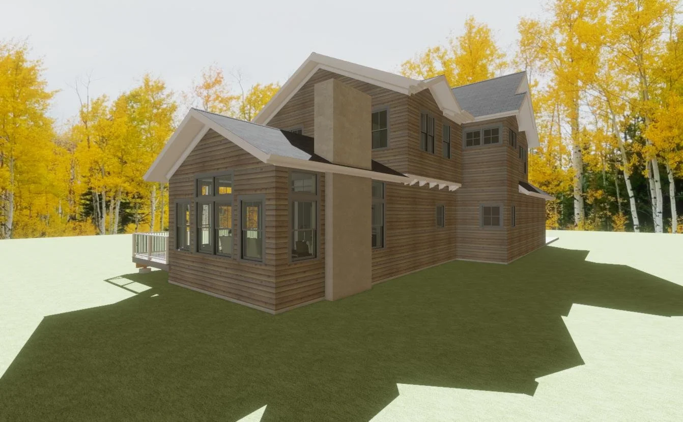
Stair wraps around elevator to provide ample opportunity to flood the interior with natural light.
Wall of glass provides views of lake and skyline. Height above street assures privacy.
Views, front and center!
Elevator and kitchenette ensure the rooftop terrace is the place to entertain!
Plenty of space for a small group to dine or spread out a buffet style offering on the island.
Great space on the roof for those warm summer days when it’s raining, or cool days in the spring and fall when a fire is a welcome addition.
Unobstructed views and sunlight.
Contrary to what one might think, the name of this project is not a play on a famous work by the master architect, Frank Lloyd Wright, rather is it simply a reference to the cascade of water from the roof that is intended to be a feature of the house. With large expanses of roof sloped inward, the water would dramatically cascade down onto lower roof planes, the courtyard and front entry to create a dramatic effect for the occupants during rain events.
The cascade of water however is only one of the aspects of this dramatic design that I hope to convey through this model. With the wall-sized openings and deeply set end-wall, there are two balconies from which one might enjoy a surrounding landscape. Modeled as a hill-side, this affords the interior spaces not only an expansive view, but enables the interior to open fully to the landscape. Paired with the courtyard in which some additional greenery has been inserted, the interior of the house is given ample opportunity for cross ventilation and additional sources of natural light.
The main living level supports formal and informal living with a main open plan living room, dining room and kitchen that supports entertaining and family holidays while a more enclosed family room space can be used for more private family time. The second kitchen, a feature that is growing in popularity, provides ample space to provide for almost any kind of event while keeping the open kitchen more pristine and from which to serve food to guests.
The lower level walk-out, left undeveloped in this model, contains more than enough space to provide for additional bedrooms and family space. The main level, broken into two wings, public and private also supports a private suite for the owner away from the noise of the public spaces and kitchen areas.
A client approached me with a detailed outline of the house he was looking for; the number of bedrooms, bathrooms, living spaces and the rough square footage of all these various spaces. Additional information provided suggested finishes and appliances. The general aesthetic goal was also in keeping with many of the new projects popping up these days; the “farmhouse” type.
It was a well-worn, well considered approach to their project. Unfortunately, the devil thwarts even the best laid plans and this one was no exception. Pandemic and its ultimate aftermath of economic disruption and inflation conspired to make this project suddenly untenable for this client but the project demonstrates the potential of a typical South West Minneapolis lot. The current home occupying this location is a simple, single-story house. The proposed house has more space and is in keeping with current thinking about how people want to live; open plan, the central role of the kitchen in daily life, natural light, separation of living space from the street to name a few conceptual bases for the plan.
Though this plan hasn’t been built and it had only made it partially through the design process before the plug had to be pulled, the exterior envelope and the general layout had been well considered but things left for further development included most of the details; kitchen cabinetry layout, bathrooms, tile, stair details and the like. The model that was used as part of the planning process was used primarily as a tool for verifying that the proportions of the plan, ceiling heights and adjacencies were working in unison. It is an effective visualization tool though it has its limitations and should be taken with a grain of salt as it can be difficult to color outside the lines with a program that has some inherent assumptions built into it.
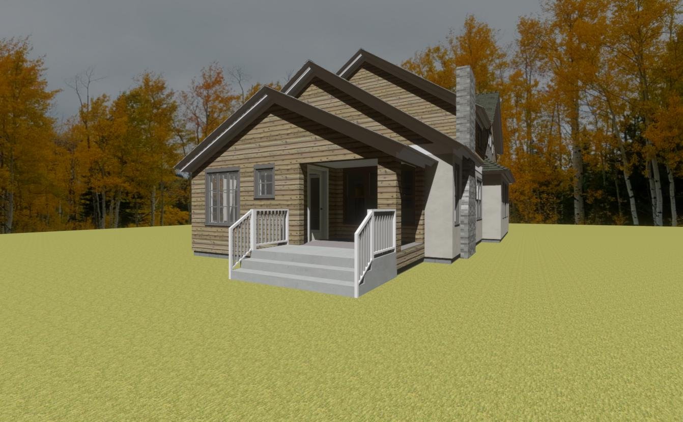
The mandate was to diminish the impact of the garage on the façade; tying the garage in with the front porch via the shared roofline and separate garage doors diminish the mass of the garage.
South-facing side of the house steps back to improve access to southern light and gains a few precious feet to squeeze in a small deck.
Bump out of stair and cantilevered second floor with single story living room at the rear of the house help break down the mass o the house and give it the appearance of a house that has been in situ for much longer appearing to have already undergone successive additions.
Projecting the living room off the back of the house as a single story volume provides the opportunity to vault the interior of the living room space; that’s just one of the many avenues explored in this design.
The bump out of the second floor allowed the primary en-suite to accommodate a full four-piece arrangement of fixtures and gives the tub some room to breathe while breaking down the façade similarly to the south-facing elevation.
The generous allocation of large windows, transoms and stepped gable ends assures that the face of this house won’t just be an unfriendly garage door with the house turning its back to the street entirely.
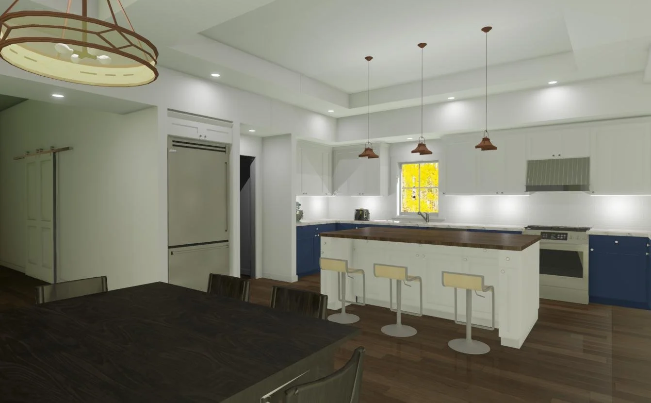
With the kitchen anchoring the corner, the dining room and living room are connected but separate spaces in their own right. Placing the deck in an interior corner gives it the feel of an outdoor room.
Entering the house from the garage and passing through the mud room and butler’s pantry deposits into the kitchen while a generous hallway leads visitors from the front door into a space between the kitchen and dining room.
The dining room has its own tall storage for special items and seasonal dishes. The butler pantry can be seen to the right of the refrigerator offers additional storage capacity.
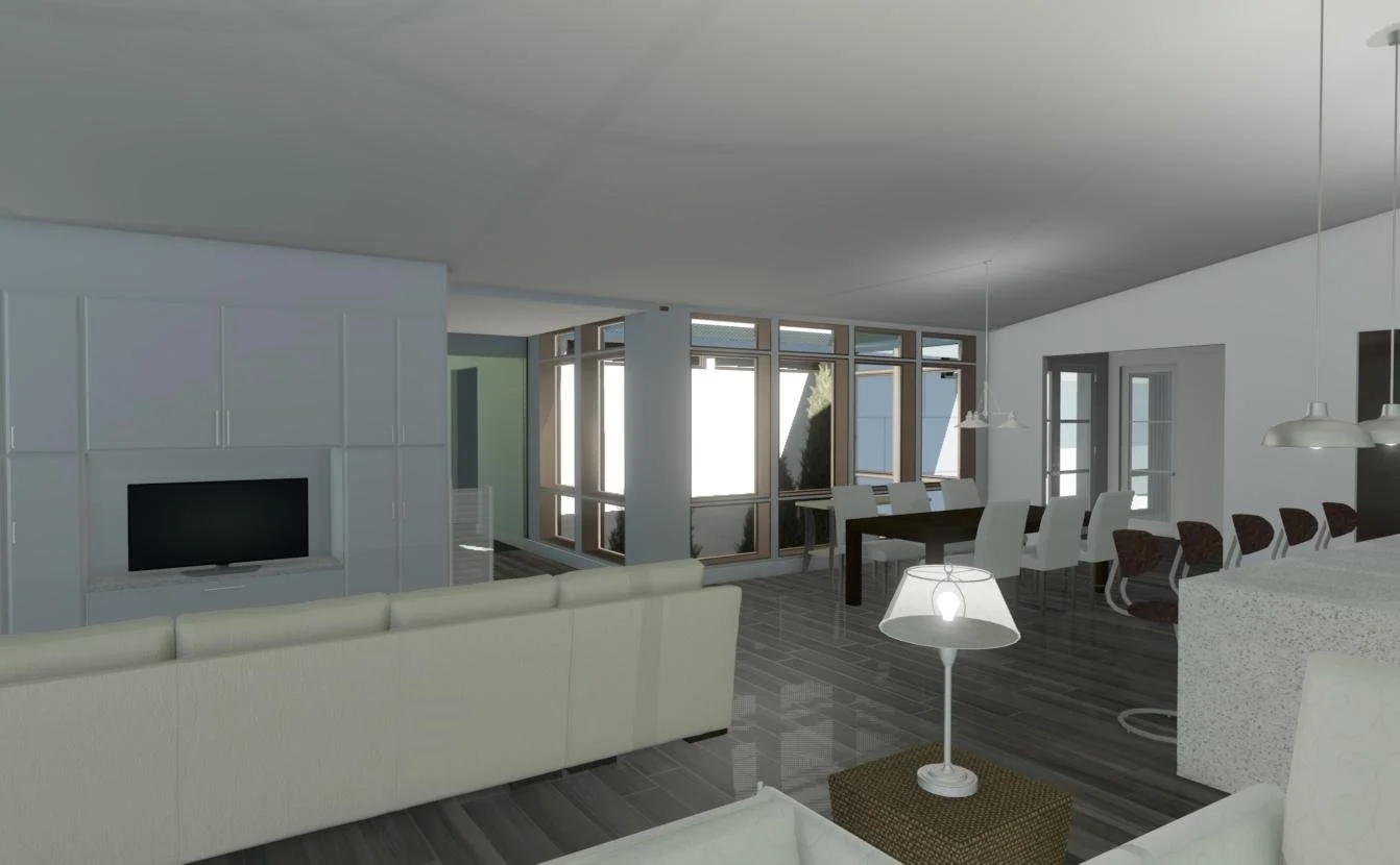
The living room, though closely connected to the kitchen, feels like its own space. Framing the opening between the living room and kitchen with wing wall and soffit enables the spaces to feel separate but not enclosed.
With large doors opening to the deck, the living room can expand to include the outdoor space in the warmer months of the year.
Large windows, and smaller, wrap-around windows give this space it’s airy open feeling. Letting the roofline express itself on the interior lends a hint of cottage feeling to the space without compromising openness.
This proposed project started with a returning client who was in the process of a new home search. They were interested in finding an existing house to remodel and make their own. In this case, it was a relatively small house in South-West Minneapolis that was full of original charm but lacked a lot of the elements that are sought in new construction; open floor plan, en-suite bathrooms and large open kitchen spaces that flow into living spaces. Other short-comings of the existing house involved the small size of the house (only two bedrooms and one bath!) and the awkward attic access (through a bedroom closet!). The tuck-under garage was much too small to accommodate a modern car, accessed through the side of the house which occupied a corner lot, and the basement was unfinished.
The redesign ambitiously sought to expand both the footprint of the house, adding space to the back of the house and increasing the height of the house to enable enough headroom on the upper level for new bedrooms and an office space.
The purchase of the house fell through, so the planning was only competed through an early “design development” phase of the process. However, the computer model was advanced enough to show the potential of the existing house to accommodate current concepts in space utilization and function. The house ultimately was bought by a developer and replaced with new construction, however there are a lot of Minneapolis homes that could be resurrected and brought into the current century with an approach similar to how this client approached this particular house; the charming core of the existing house can be a catalyst for inspiring an addition that both blends with and enhances that existing core. The aesthetic has one foot in tradition while the open plan plants the other in our current way of living.
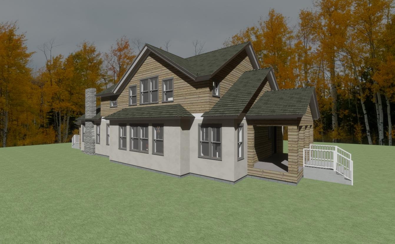
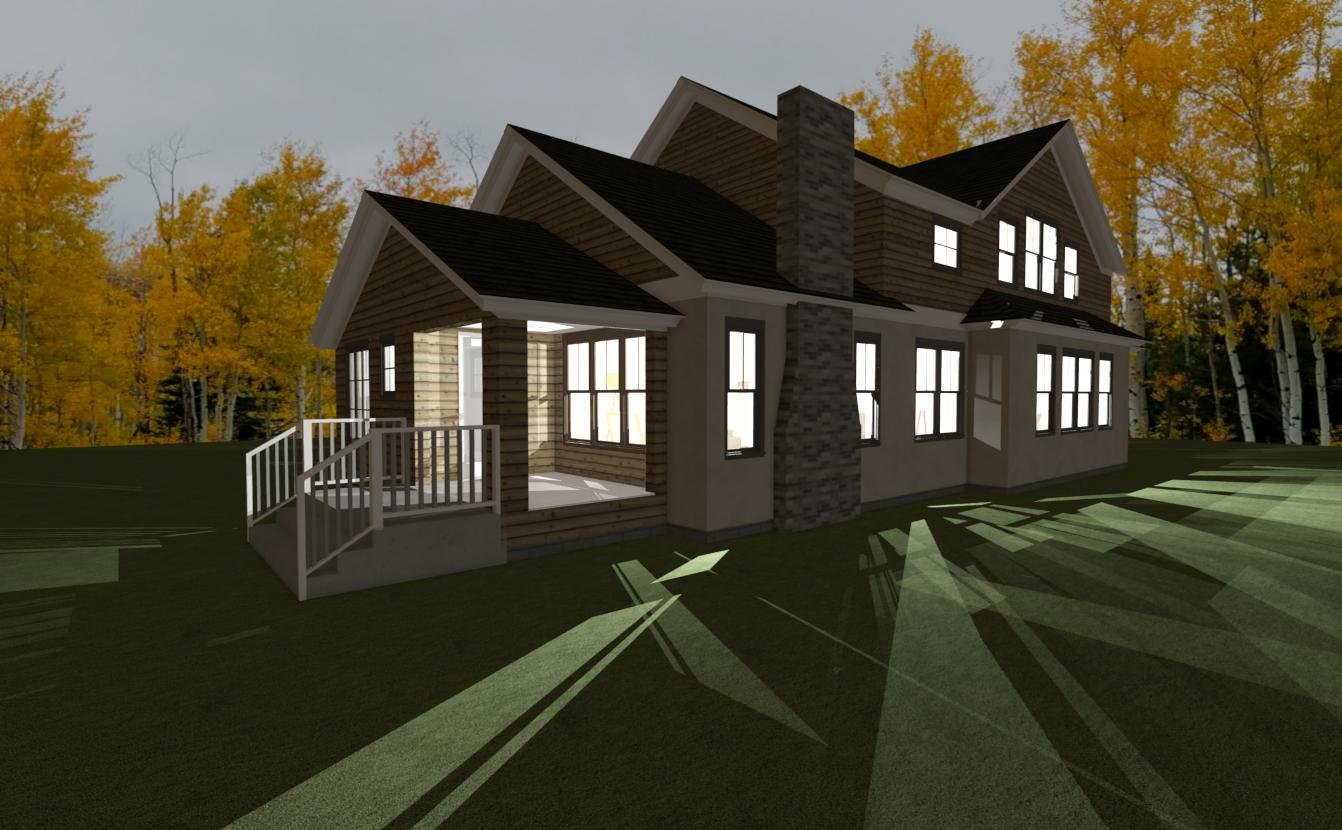
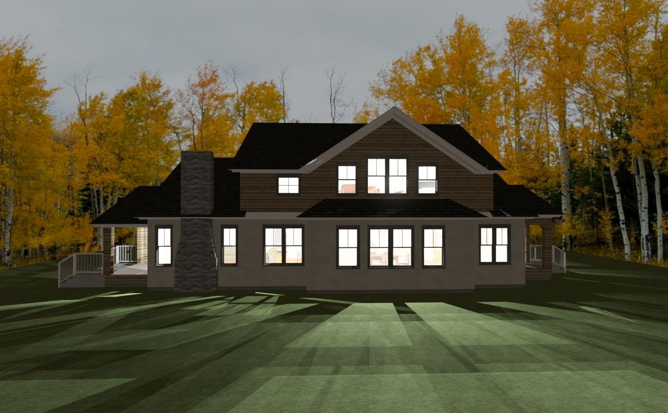
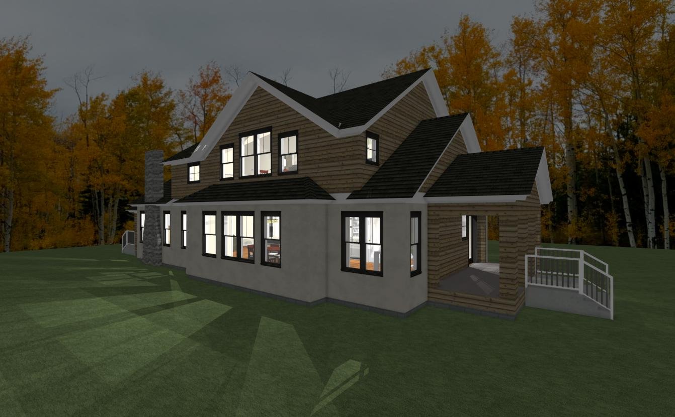
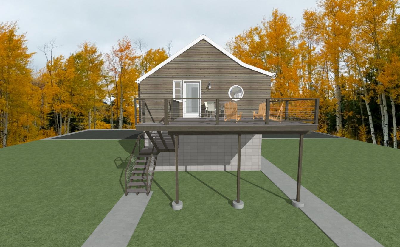
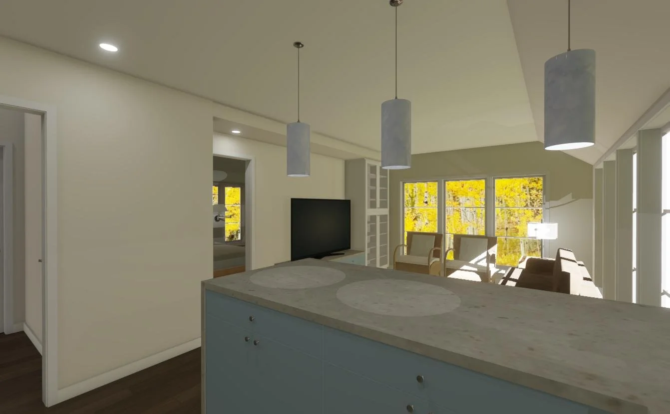
Originally this client had come to me with the idea of remodeling a portion of the house that was only one story; the idea was to add space to the second level of the house. However, upon further examination, the footprint of that space was quite small and it would have proven to be difficult and expensive to connect the resulting space to the house seamlessly. An alternative idea was conceived. Given the need for a new garage, the existing one was becoming structurally unsound, it seemed like an accessory dwelling unit, or ADU would fulfill two needs in one; the need for some additional space and a garage.
The design took advantage of the relatively large footprint of a two-car garage, with some additional overhang space to give the apartment a little more elbow room. The roof forms, inspired by the existing home on the site were modified slightly to enable the proposed ADU to comply with the tight height restrictions imposed on the type within the City of Minneapolis. Thus the “kinks” in the roof line that add headroom to the parts of the project that needed it the most; the kitchen and the bathroom. The result is a charmingly quirky exterior envelope that has a diminutive scale yet accommodating interior space.