
Your Custom Text Here
Though my client referred to her new townhouse as a “dump” when she bought it, she wisely saw its potential through the veil of outdated fixtures, old appliances and tired finishes. However, she felt a little overwhelmed by the task of re-imagining how the space would be used and how to make the existing space into a new, modern, open space with the kinds of amenities that people look for in new construction.
The original, two-story town house had two bedrooms on the upper level with one on the lower level, two modest full bathrooms and a master bathroom that was large but oddly proportioned. The upper level layout however didn’t quite support how she wished to live; she hoped to have a master bedroom with a sitting area and en-suite master bathroom with a window (the original master bathroom was interior to the townhouse and didn’t have access to an exterior wall). The over-sized space of the master bathroom was re-allocated to create a walk-in closet and powder room, while the adjacent 3/4 bathroom space was enlarged and connected to the master bedroom via the second upper level bedroom to create a luxurious 4 piece master bath with an exterior window thus making it a much more inviting and soothing space.
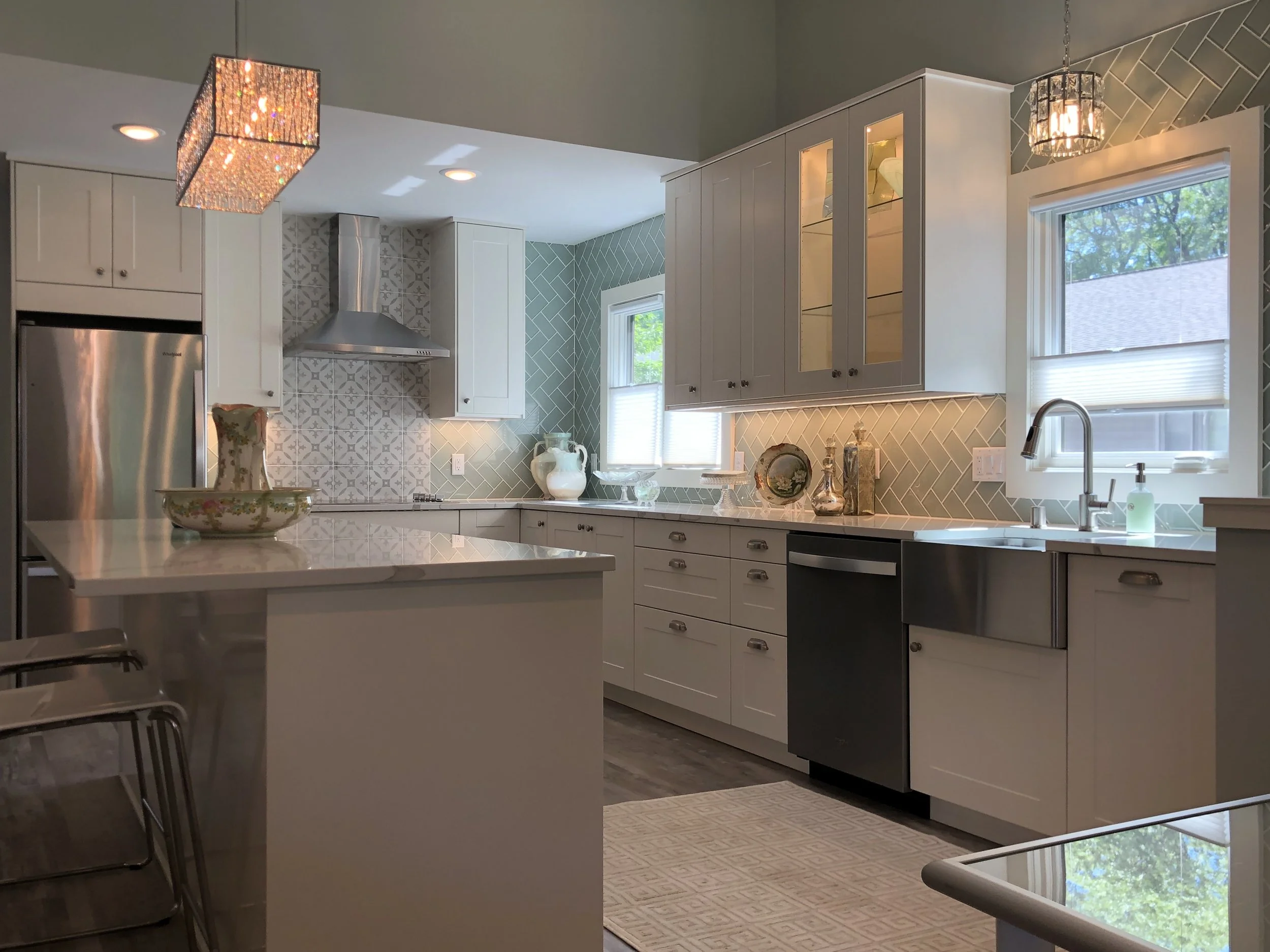
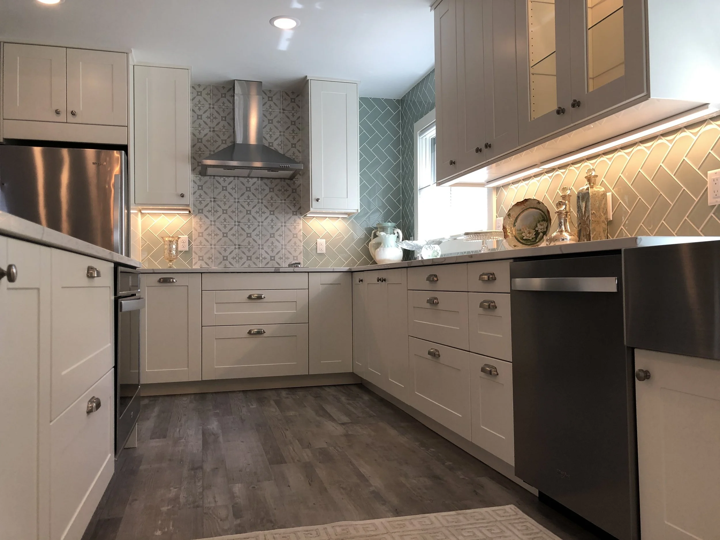
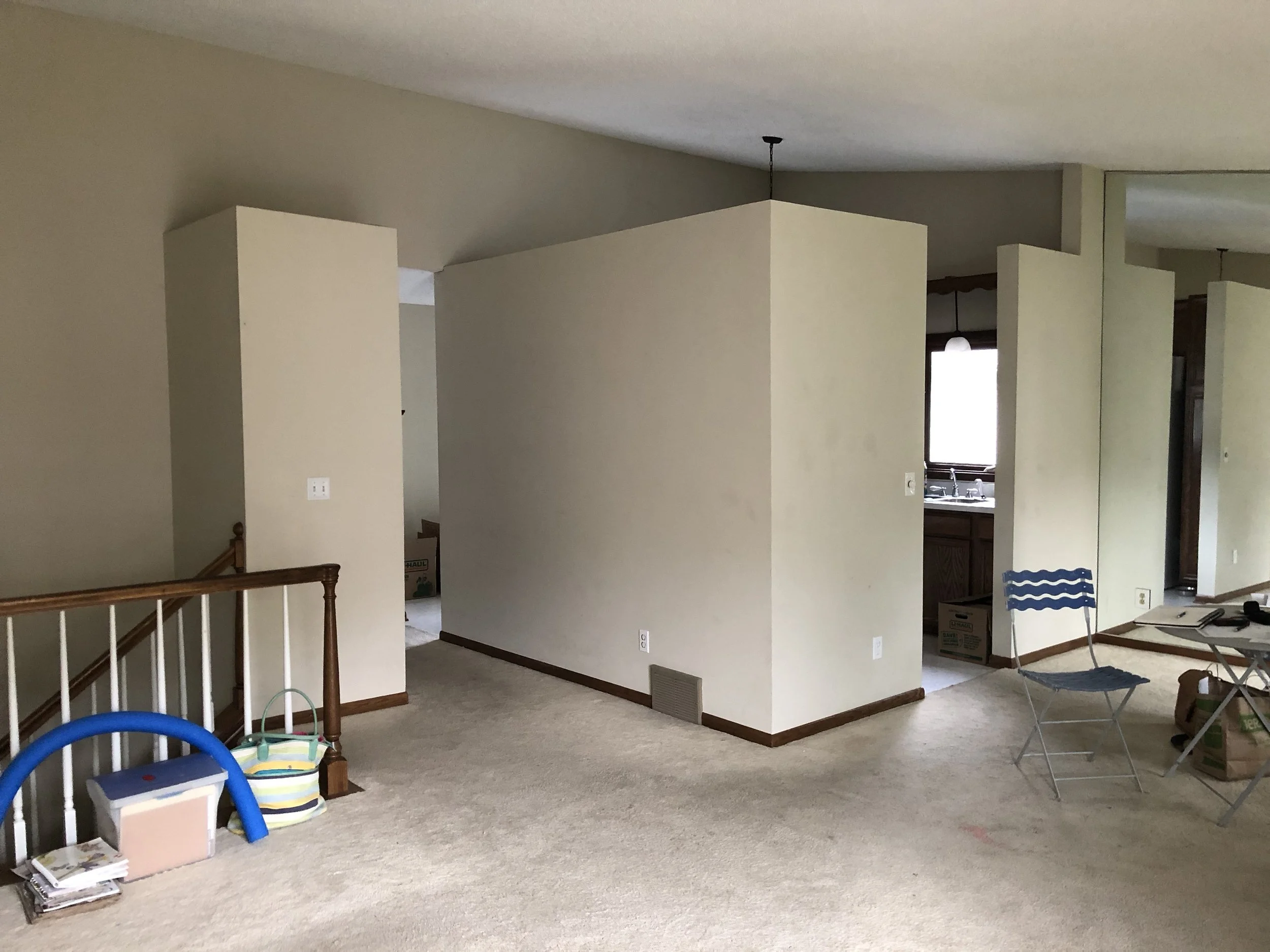
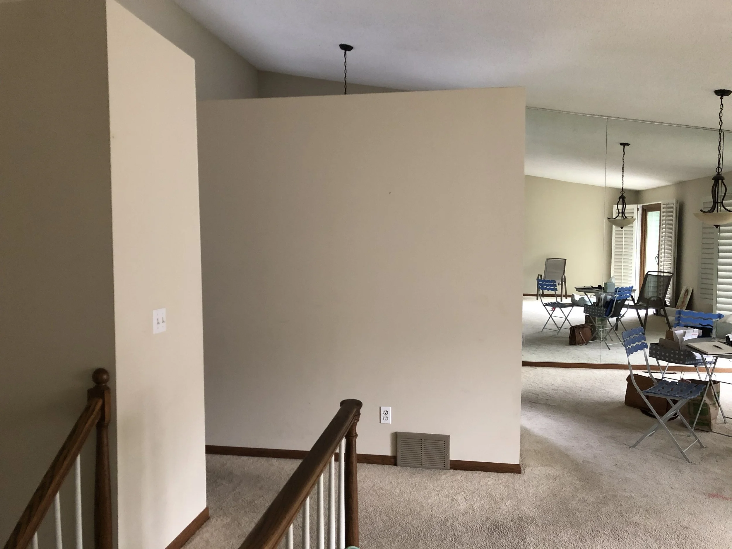
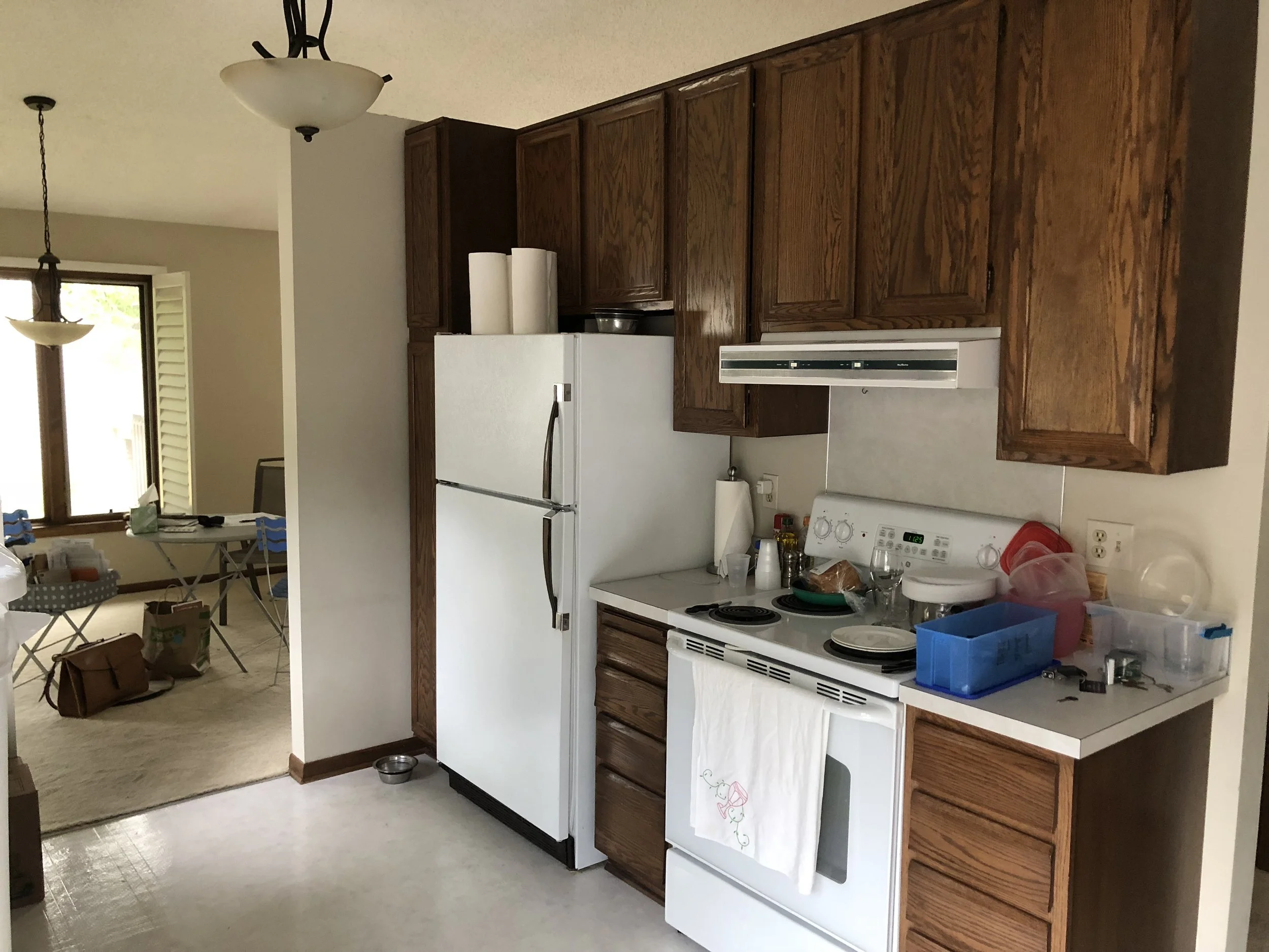
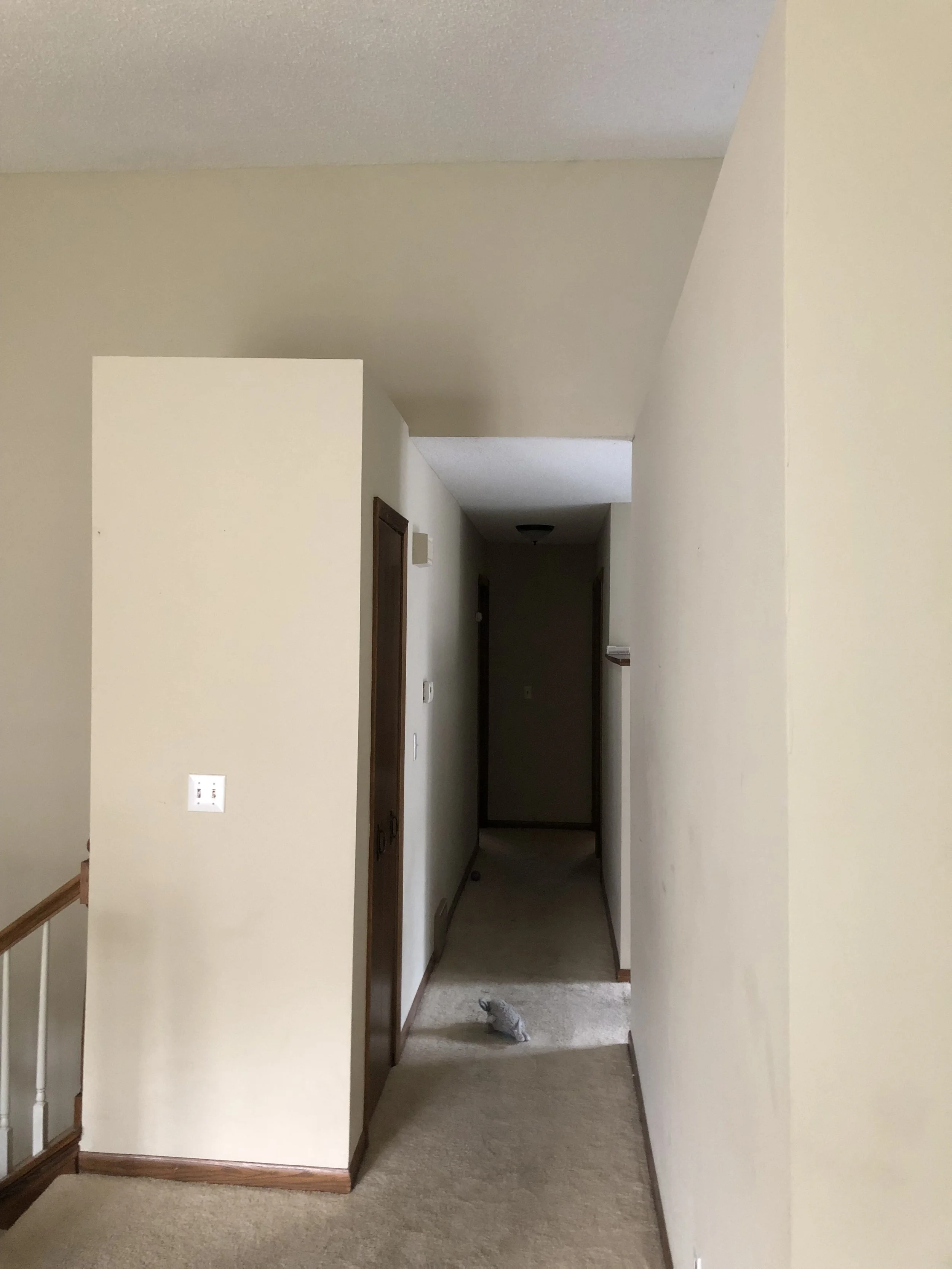
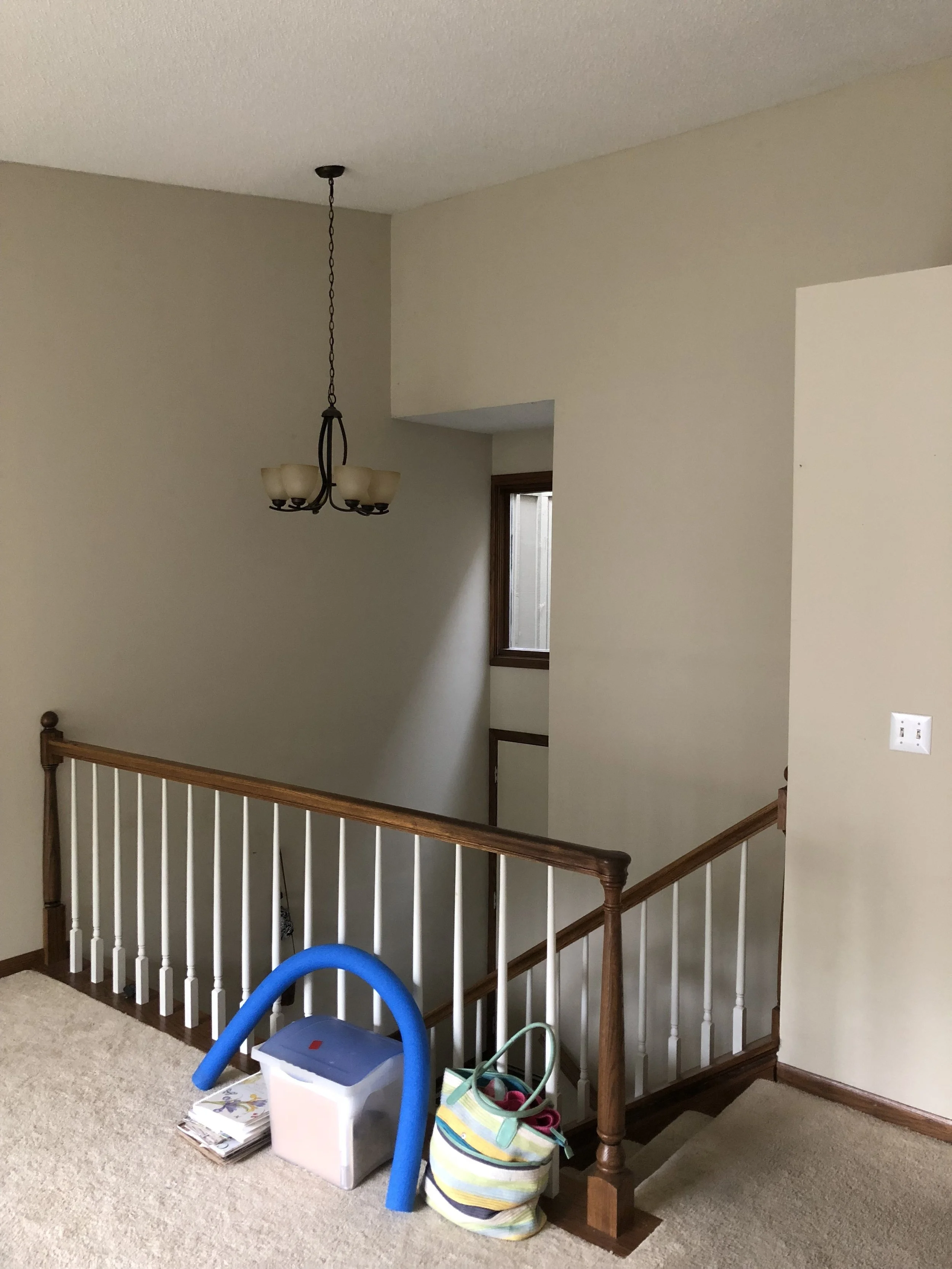
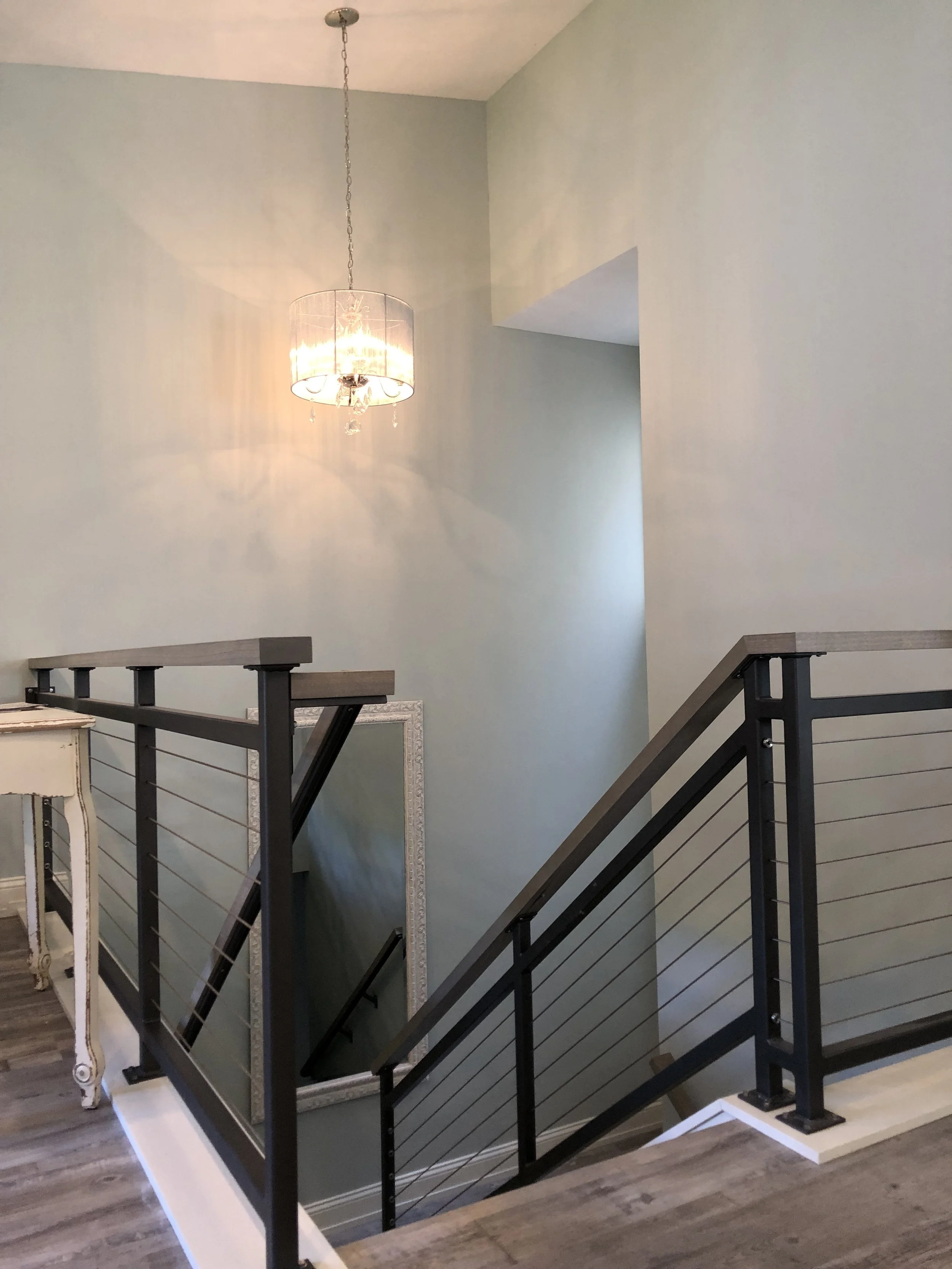
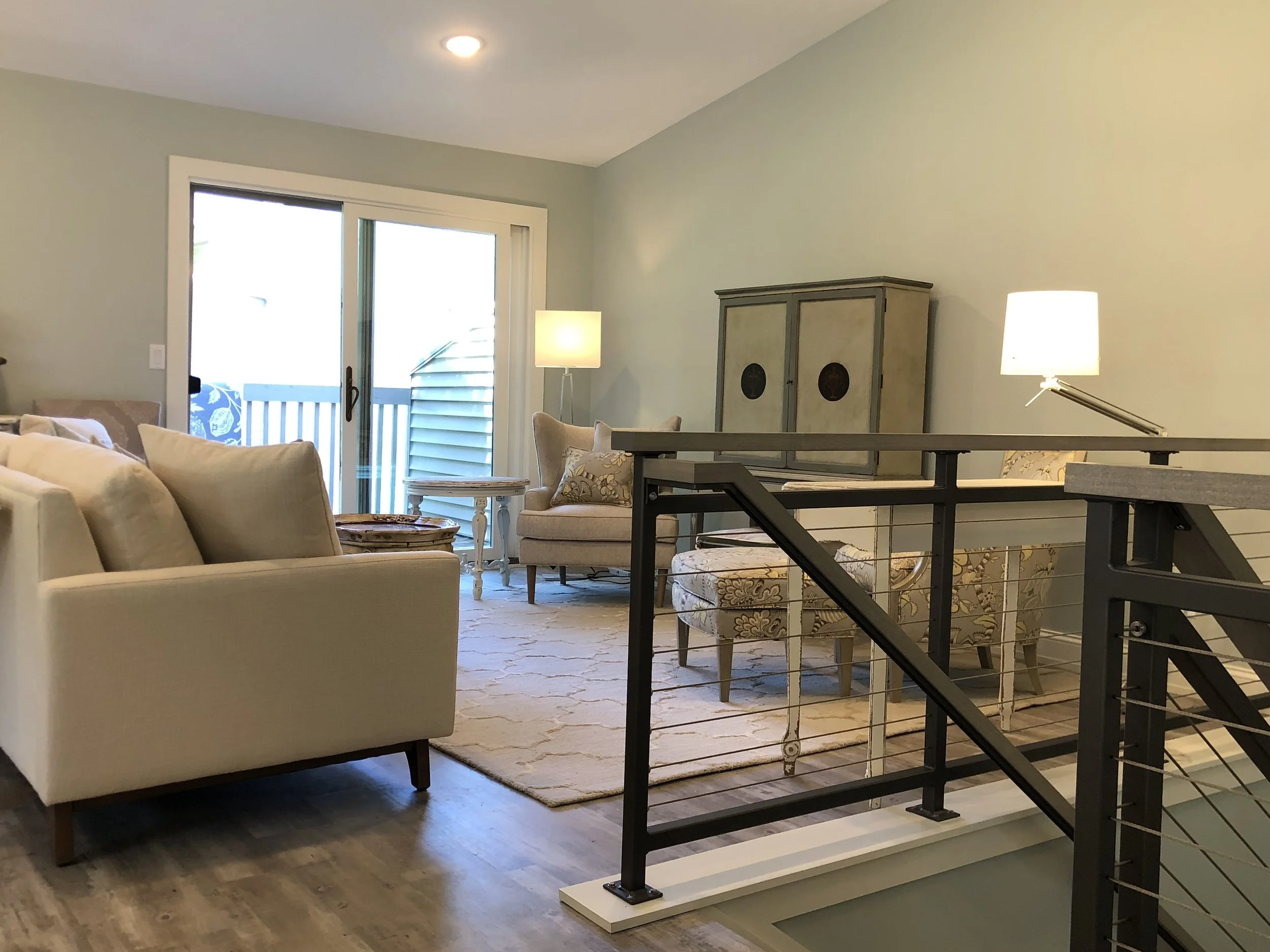
The living room, dining room and kitchen in the upper level of the townhouse, in spite of the high ceiling that follows the slope of the roof, felt segmented and the spaces a little cramped. The use of partial height walls to define the kitchen and the broom closet that was hanging in the space at the top of the stair only served to further break the space into smaller pieces. Removing the partial height walls at the kitchen and taking the “eat in” space within the kitchen to enlarge the work space enabled the focal direction of the kitchen to rotate 180 degrees. The removal of the broom closet (it was relocated) enabled more openness at the top of the stair and better flow around the new, large island in the kitchen; enables the island to function better as a serving area when entertaining.
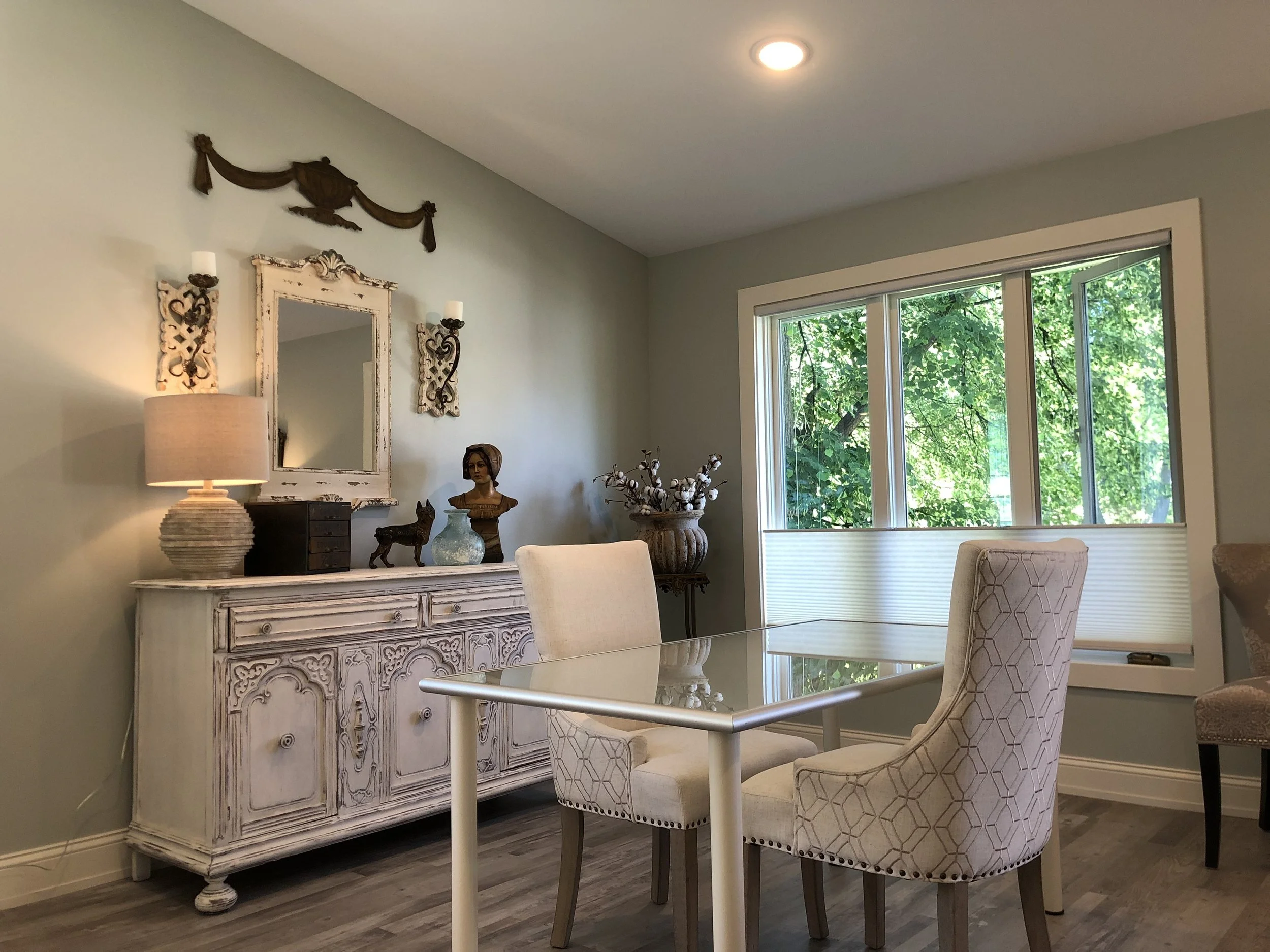
The homeowner, using her keen eye for interior design, selected finishes, fixtures and appliances on her own. She creatively re-purposed furniture and other items for an interior that is airy and inviting. The overall result is contemporary and modern with a patina of time to give it a warm and welcoming feel.
Updated Kitchen
With walls removed, kitchen become the hub of living space.
Kitchen: New Layou
Reusing eat-in area for kitchen work space enables “L” shaped work area along the exterior wall allowing the subsequent removal of partial-height wall.
Main Living Room
Partial height wall separates kitchen from living and dining room; closet protrudes from wall at stair.
Top of Stair
Interior is broken up with partition walls and closet.
Dinning Room
Dinning room is open to living room and kitchen.
Original Kitchen
Partial height wall is backdrop to appliances but sacrifices openness.
Original View Toward Bedrooms
Closet appears tacked on…
Stair / Main Entry
Main level entry is hampered by closet at stair.
New Guardrail / Handrail
Modern style enhances feeling of openness at stair.
Living Room
Main living space feels more open and inviting.
Original Master Bathroom
Master bathroom was large but oddly proportioned.
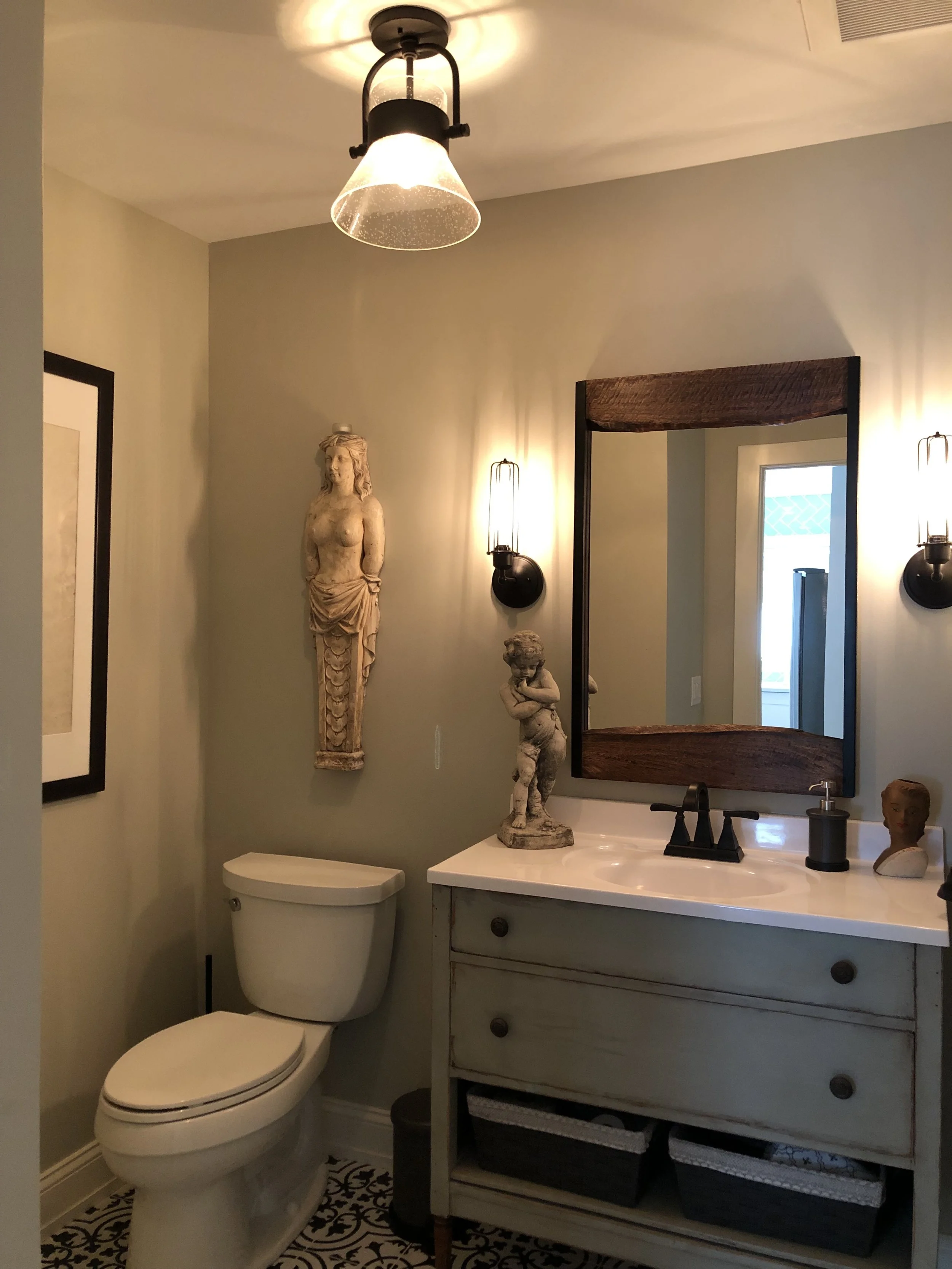
Powder Room
New powder room and closet carved out of one end of old master bathroom.
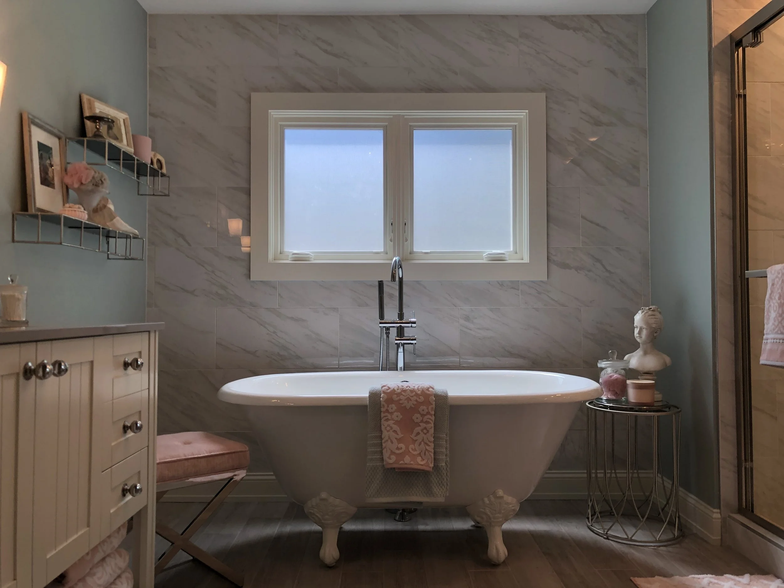
New Master Bathroom
Warm finishes, dimmable lighting and frosted glazing offer warmth and privacy.
Free Standing Tub
Careful use of space enabled bathroom to be equipped with separate shower and tub.
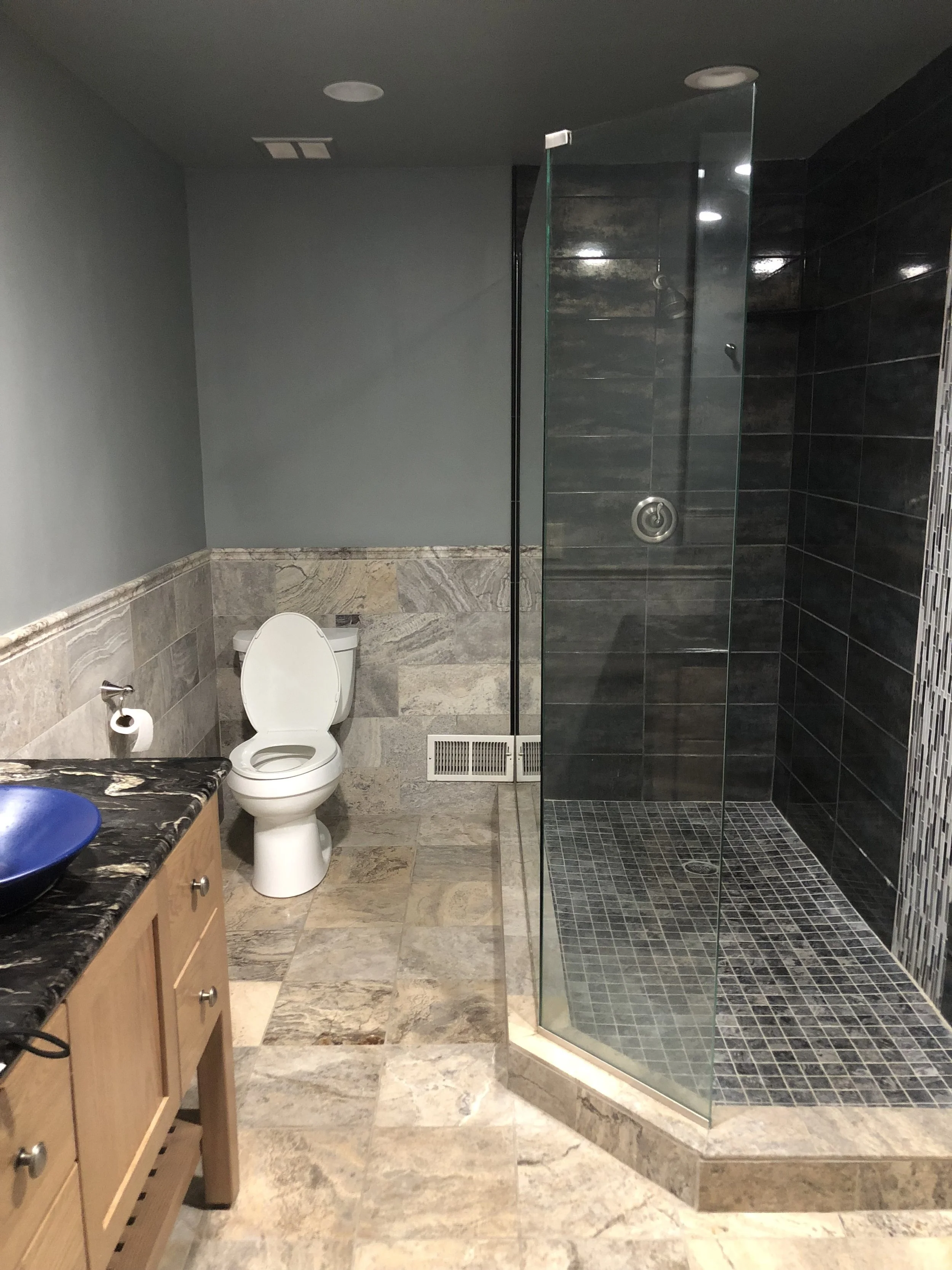
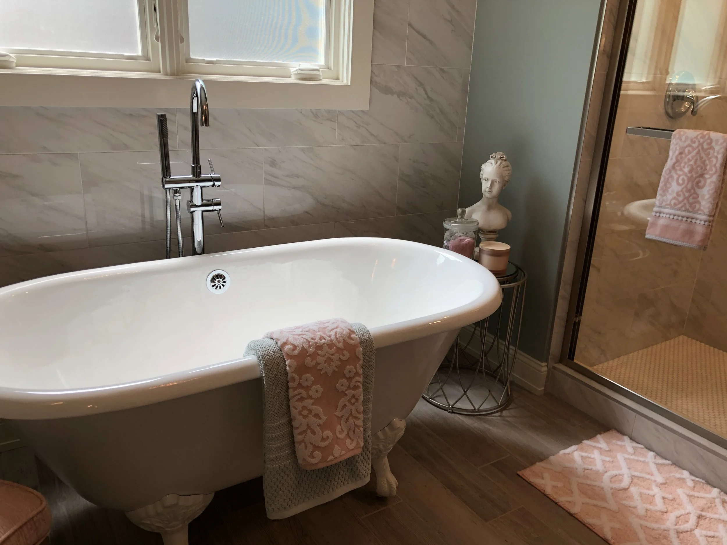
Shower Space & Tub
Generous shower with separate tub offers spa-like experience.
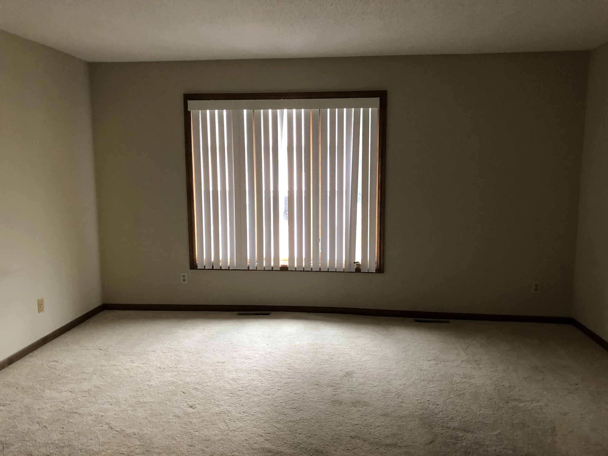
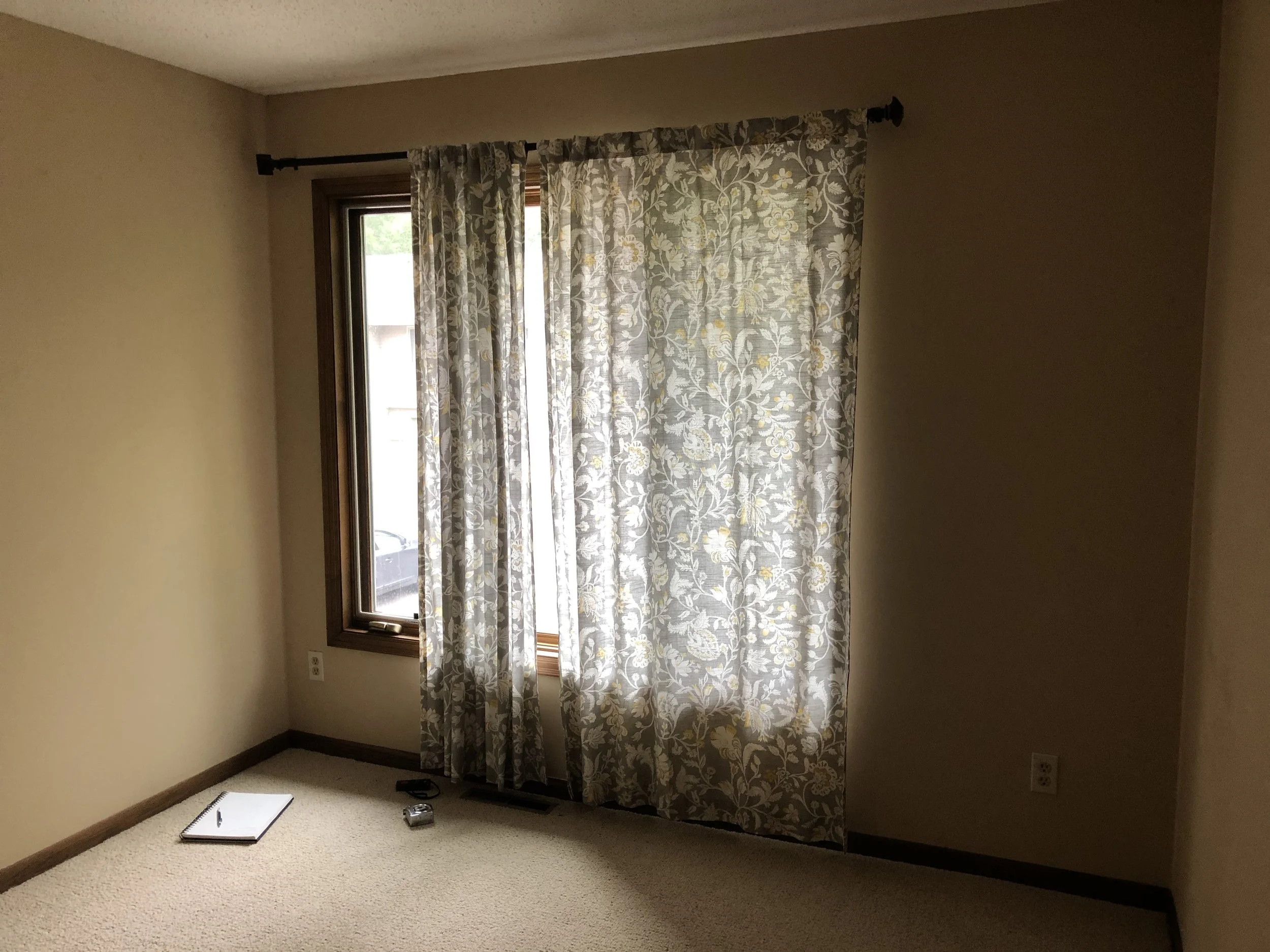
Original Master Bedroom
Original master was large but didn’t accommodate sitting area.
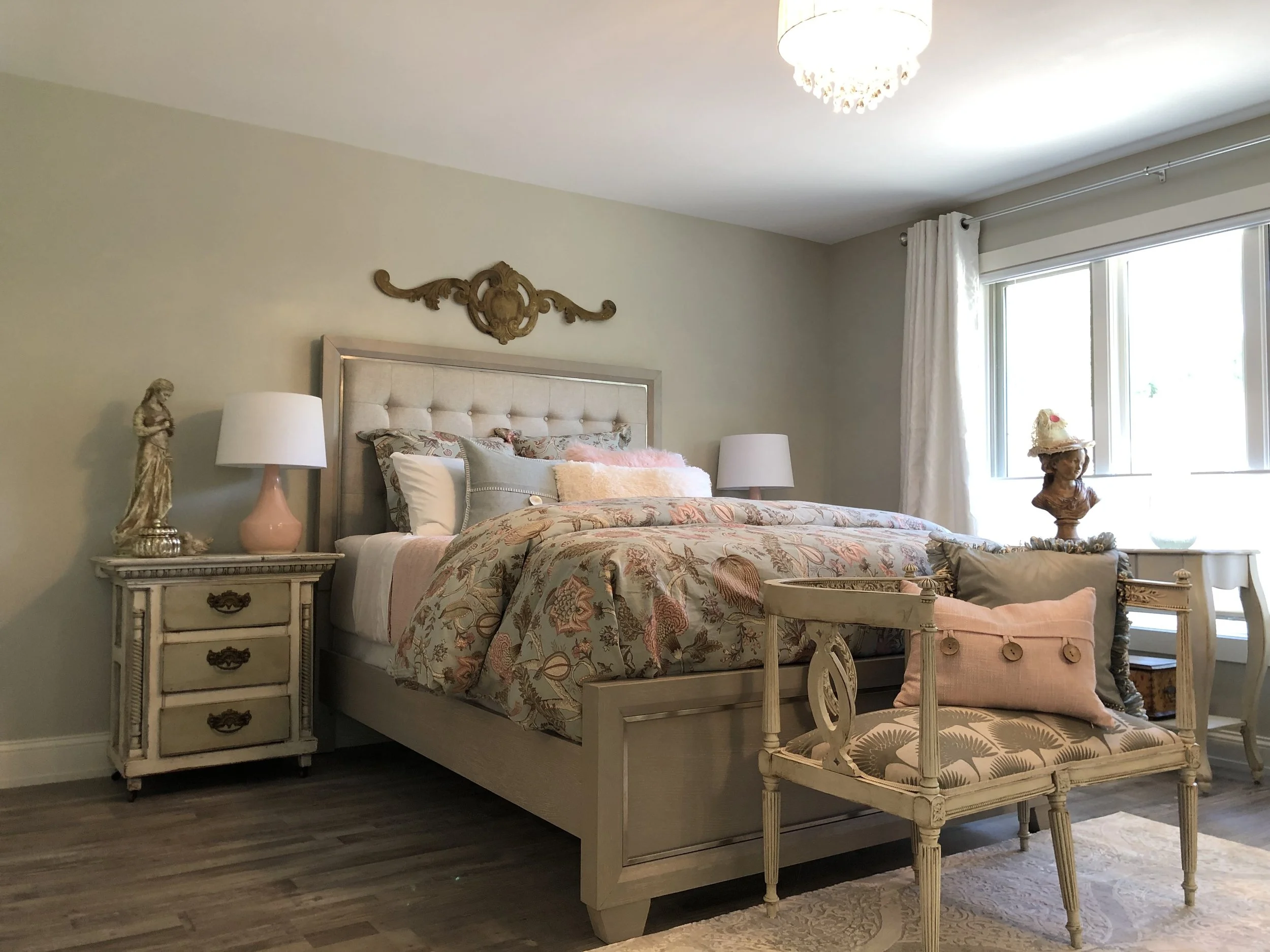
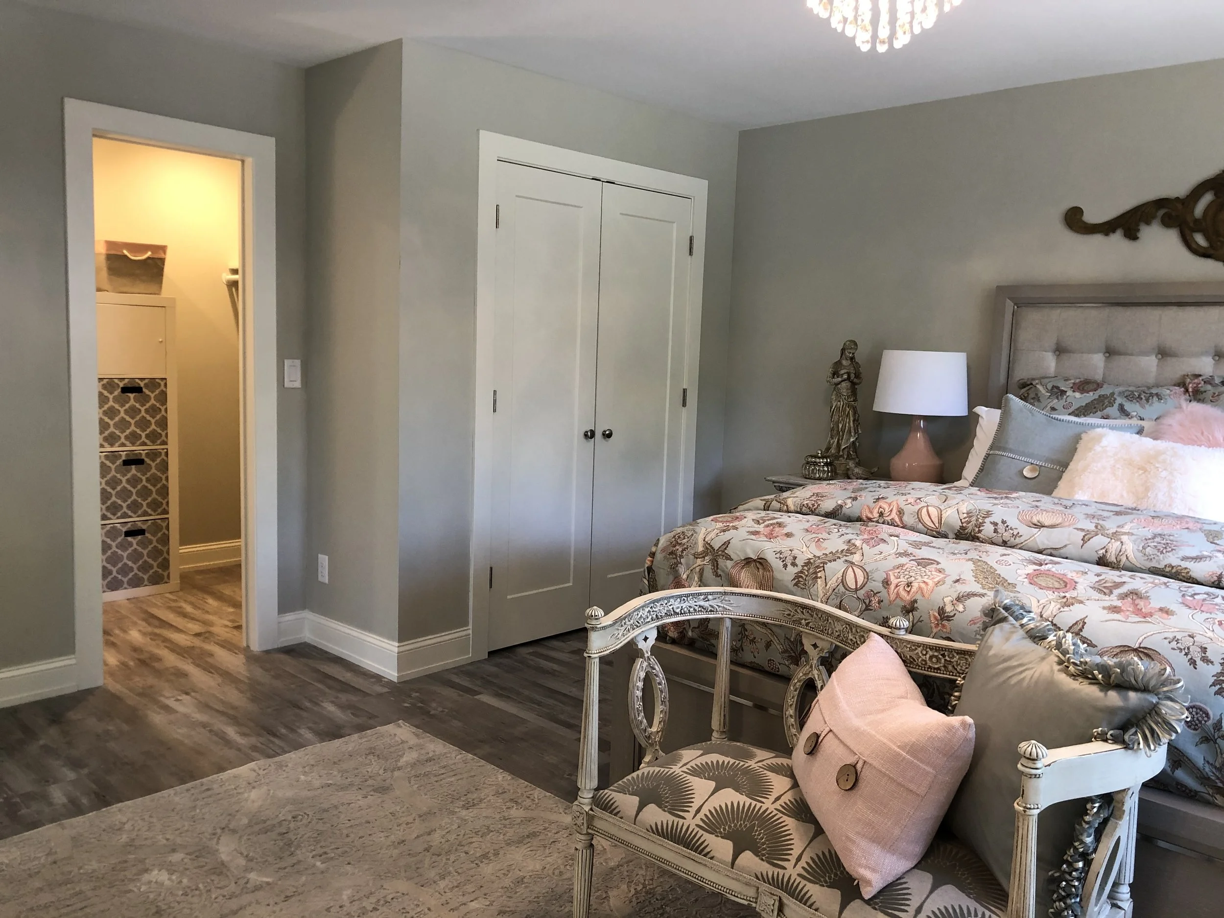
New Master Bedroom
Better lighting and newly painted woodwork give space a lighter more open feel.
Walk-in Closet
Walk-in occupies part of space that was previously bathroom while original closet remained.
Original Second Bedroom
Owner didn’t see a need for a second bedroom on upper level; part of this space became sitting room.
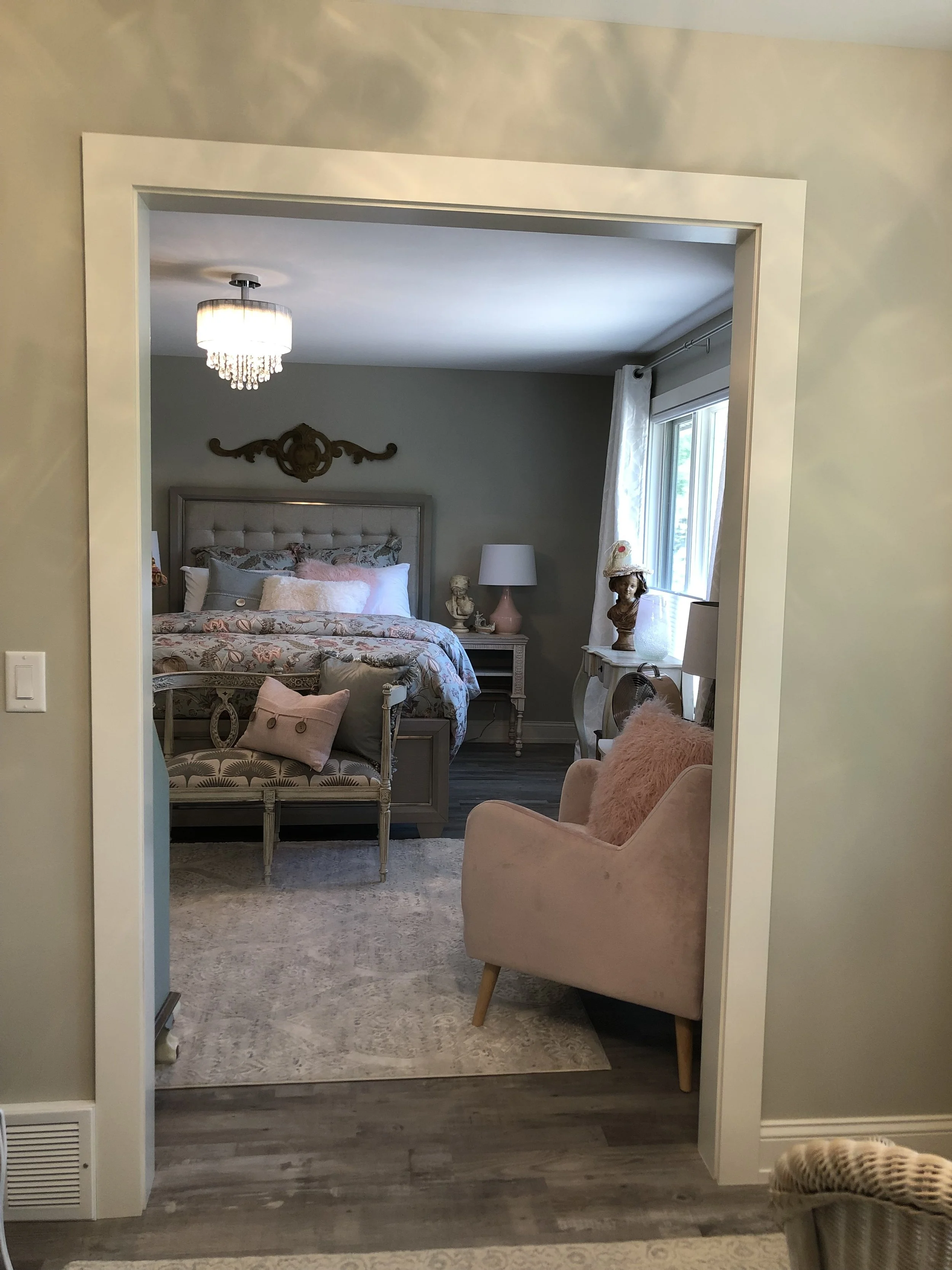
Opening Between Master and Sitting Area
The original bedrooms were connected to create sitting area and enlarge bathroom.
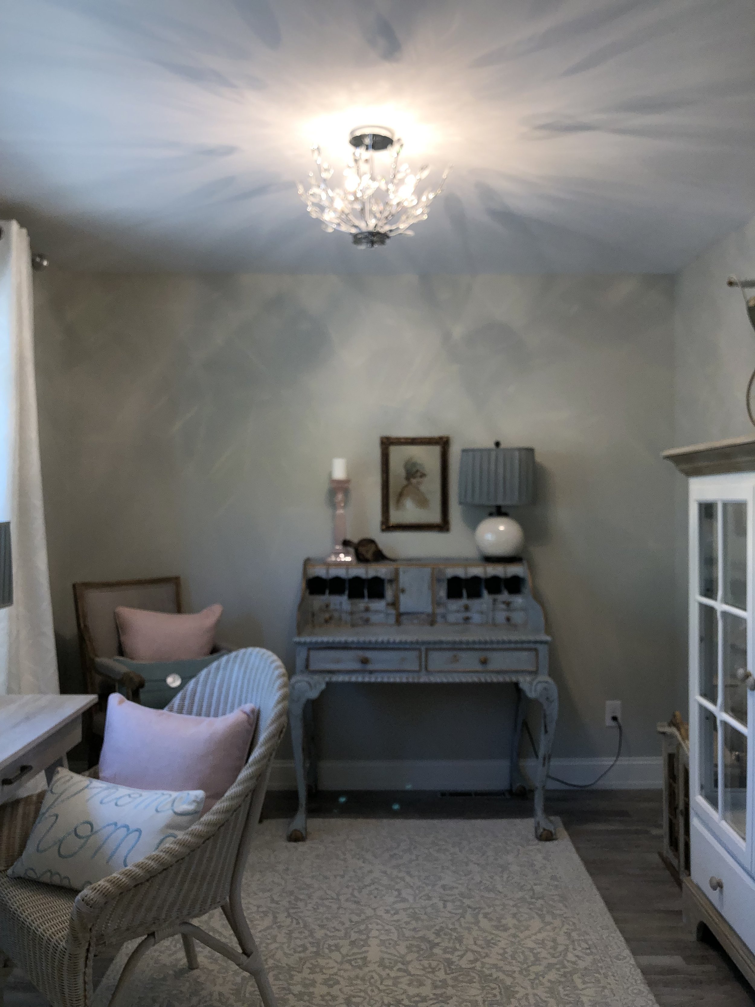
Sitting Room
Perfect space for doing projects, reading, or relaxing.